BRANDING GUIDELINES
PLEASE FOLLOW OUR GUIDELINES WHEN MENTIONING OBV IN EXT. MEDIA
/
/
/
/
/
/
/
//
TITLE & NAMING
//
PRIMARY NAME/TITLE
The full company name is always written as ONLYBADVISUALS in uppercase or onlybadvisuals in lowercase. Do not mix capital and lowercase letters. Whenever possible, prefix the name with two slashes.
Examples:
// ONLYBADVISUALS
// onlybadvisuals
TITLE WITH SUBTOPIC
If the brand name appears on the same line as a subtitle or secondary topic, start with the logo or the full name, then use two slashes before the subtitle.
Examples:
onlybadvisuals // example
ONLYBADVISUALS // EXAMPLE
ABBREVIATIONS
The company may be abbreviated simply as "OBV". Use either all uppercase or all lowercase to match the chosen naming style.
LOGO USAGE
//
The ONLYBADVISUALS logo is a fused monogram composed of the letters OBV, set in Chivo Mono ExtraBold Italic. It is a fixed mark that must always be used exactly as provided. There is one official design, available only in black and white. No other variations are permitted.
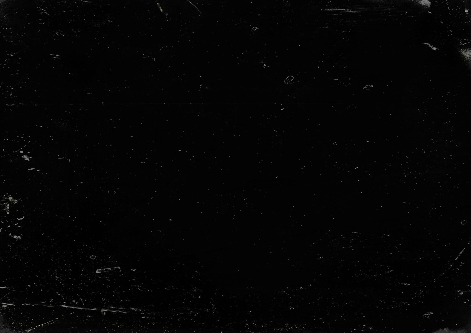
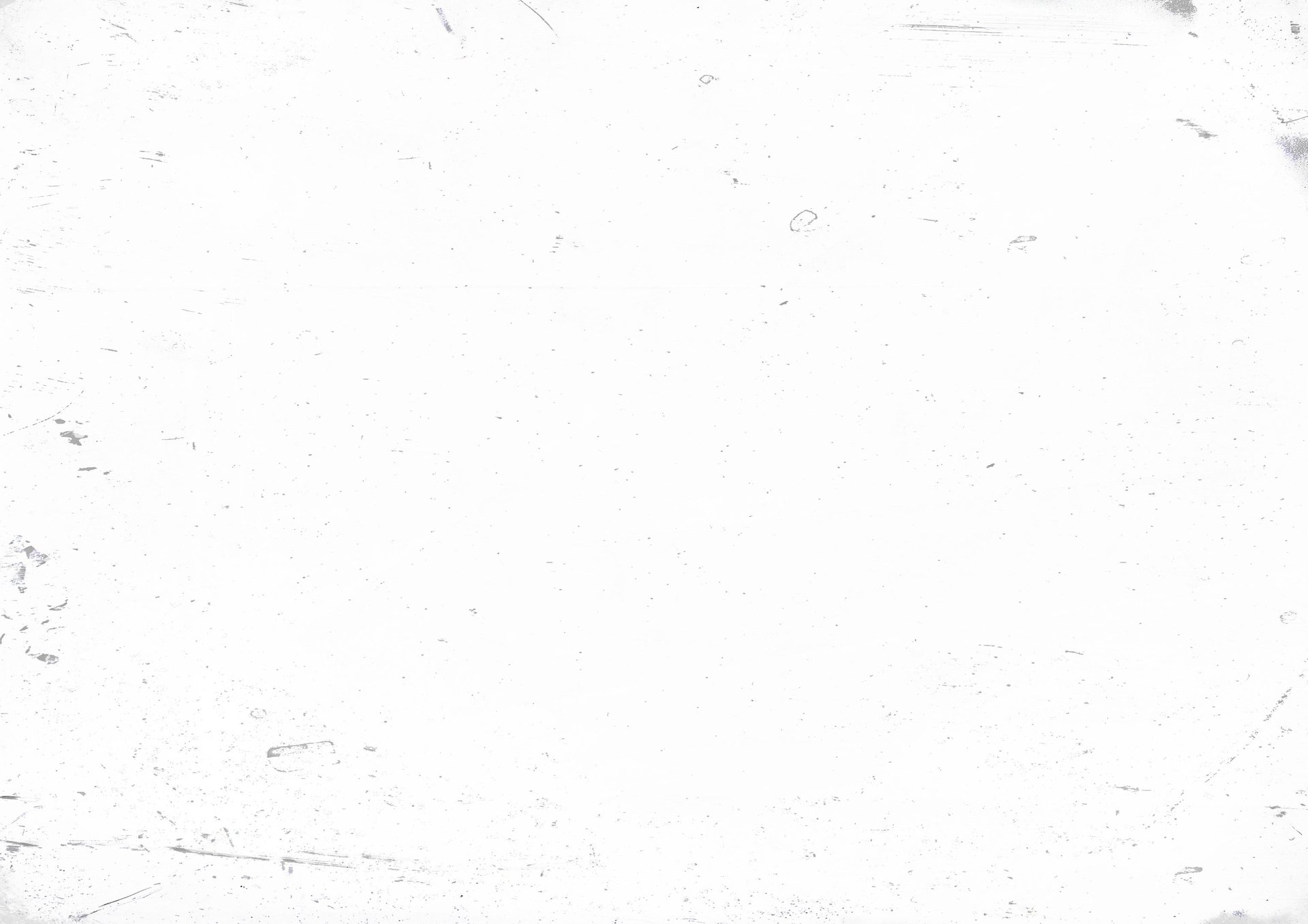
When used in non-OBV publications or environments outside direct creative control or oversight of the OBV team, the logo must appear in either black [fig. 01] or white [fig. 02], or in a tone that contrasts at similar to 80/20 against its background. E.g using a 20% grey logo on an 80% grey background, or any pairing that maintains the required visibility and clarity. [fig. 03]
The logo color should always contrast cleanly with its background so that the mark remains readable and dominant in any environment. There is no fixed color palette. Colors may shift between projects and over time as part of the brand’s adaptive identity. For core branding, default to a monochrome approach, for creative branding, work in color as long as it follows the 80/20 contrast ratio [or similar ratio, see fig. 03]
DO NOT:
Stretch, skew, rotate, or change the aspect ratio of the logo
Apply filters, visual effects, gradients, shadows, outlines, or texture unless explicitly intentional for a project and approved by OBV.
Place the logo on chaotic, highly textured, or low-contrast backgrounds
Crop the logo, slice it, merge it with other symbols, or alter spacing
Recreate, redraw, retype, or substitute the logo using other fonts
Manipulate the logo in any way that could misrepresent or dilute the OBV / ONLYBADVISUALS identity
The logo should always appear clean, intact, and unobstructed. Its visibility must remain consistent across print, digital, and motion projects.
Maintain generous clear space around the mark to avoid crowding or visual interference.
BRANDING ASSETS DOWNLOAD


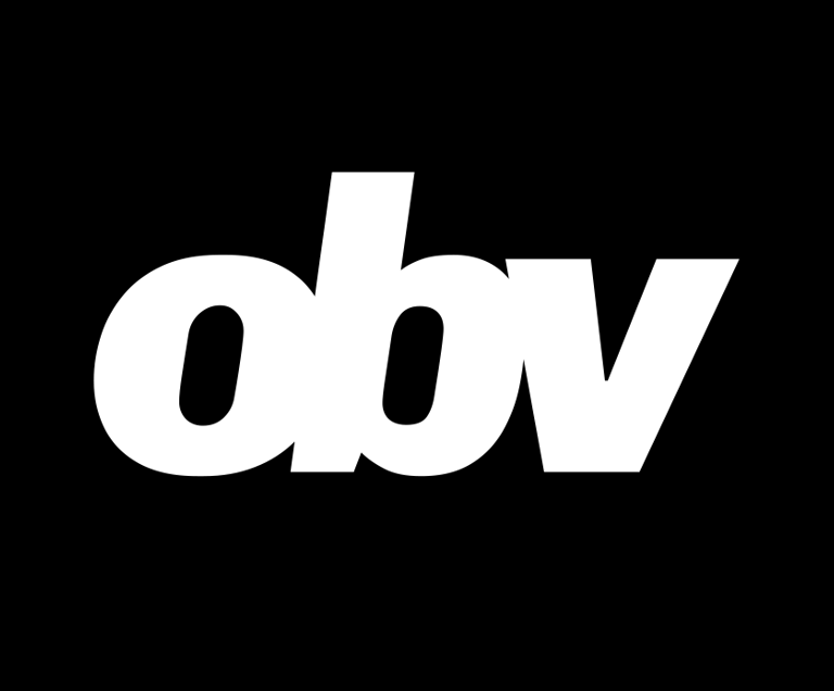
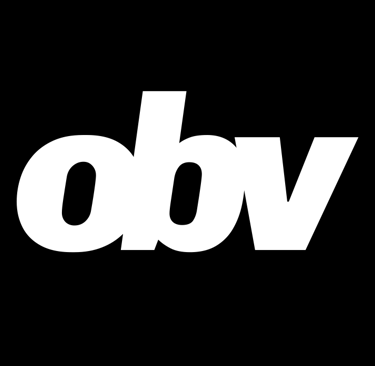
FIG. 01
FIG. 02
FIG. 03
FONTS & TYPOGRAPHY
//
SHORT FORM LOGO
The short form logo is a fused monogram (ligature) composed of the letters OBV, created using Chivo Mono ExtraBold Italic. Negative kerning (VA) is applied to merge and tighten the letters, forming a single, cohesive visual mark. This design emphasizes identity, recognizability, and strong visual impact in compact spaces. The short form logo is the primary emblem used when the full company name is unnecessary or when space is limited.
LONG FORM LOGO
The long form logo uses the full company name, ONLYBADVISUALS, set in Inter Medium or Inter Bold. This version is ideal for applications where clarity, readability, and full brand recognition are required, such as headers, documents, or presentations.
GENERAL BRAND FONT
Inter is the primary typeface for all branding materials, including paragraphs, headings, and UI elements. It ensures consistency across print and digital media, providing a clean, modern, and legible typographic system. Use Inter for body text, captions, labels, and any content that requires clarity and coherence with the brand’s visual identity.
TYPOGRAPHIC STYLE GUIDELINES
Maintain strong contrast between type and background for clarity.
Avoid decorative or non-brand fonts in any materials.
Use consistent spacing, line heights, and weights to reinforce the brand hierarchy.
Align text intentionally, whether left-aligned, centered, or right-aligned, depending on context and layout.
Avoid overcomplicating layouts; typography should support the concept, never distract from it.
DESCRIPTIVE BLURBS
//
These blurbs are vetted to be used in media publications & social posts referring to ONLYBADVISUALS as a brand/company/creative agency.
TAGLINE:
"IT'S IRONIC, BECAUSE THAT'S NOT WHAT WE MAKE..." [primary, uppercase version]
"It's ironic, because that's not what we make..." [secondary, normal version]
MOTTO:
EMBRACE CREATIVITY, EMBRACE HUMAN IMPERFECTION [only use uppercase version]
SHORT MARKETING BLURB:
ONLYBADVISUALS // OBV, est. 2025, is a creative media agency based in Aotearoa, New Zealand, focused on crafting inspiring stories through experimental visual work in photography, filmmaking, and motion graphics.
LONG MARKETING BLURB:
Established in 2025 and based in Aotearoa, New Zealand, ONLYBADVISUALS // OBV is a creative media agency devoted to the art of visual storytelling. Specialising in photography, filmmaking, and motion graphics, the agency approaches each project as an opportunity to explore, experiment, and reveal new perspectives through bold and intentional work.
Work produced by ONLYBADVISUALS is deliberate, concept-driven, and unapologetically authentic. Each project challenges expectations while remaining deeply human, balancing technical mastery with imaginative exploration. Every idea is tested, refined, and expanded collaboratively, allowing the work to evolve naturally while remaining grounded in clarity and purpose. OBV embraces contradiction and transformation, recognising that what may appear unconventional or unexpected often reveals the most compelling insights and visuals. All the while seeking to leave a lasting impression, shaping experiences that resonate, provoke thought, and open new possibilities for visual expression.
Across disciplines and mediums, ONLYBADVISUALS continuously pushing the boundaries of visual art and wildly experimenting with striking narratives that connect with audiences in meaningful and memorable ways.
If you have a project, idea, or creative opportunity you want to explore with us, feel free to reach out. We are always open to new collaborations and conversations.
// INQUIRIES
// LOCATION
// COPYRIGHT
info@onlybadvisuals.co
Wellington, New Zealand
© onlybadvisuals 2025
// INSTAGRAM
// YOUTUBE
// LINKEDIN